I'm throwing everyone a curveball this week and digging a little deeper into the collection and bringing a provincial flag into the mix. Take a bow Canucks fans because with no hockey being played, I figured the grand old province of British Columbia could use a shout-out.
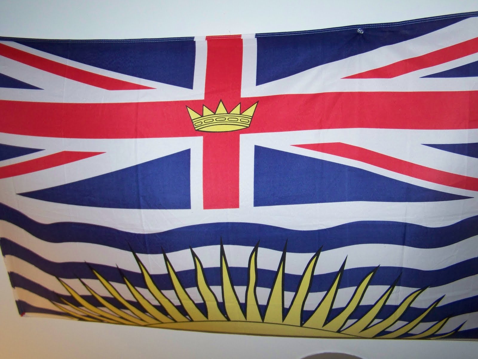
I've got to say, the provincial flags of Canada show a lot more creativity than many state flags in the United States and British Columbia is probably my favorite of the bunch. Adopted in 1960, British Columbia's flag is an armorial banner based off it's Coat of Arms which were grated in 1906. The sun placed over the heraldic waters represents the province's position on the West Coast.
An armorial banner you say? Well then, what does British Columbia's Coat of Arms look like? Behold:

You can see that most of the flag's symbolism is drawn from the shield itself. Though the crest (at the very top) is the Queen's Royal Crest- differentiated with a garland of Pacific Dogwood, the provincial flower. The supporters are a wapiti (or elk stag) and a bighorn sheep which represent the mainland and Vancouver Island which united to form the province in 1866. Finally, the motto: Splendor Sine Occasu or Splendor Without Diminishment.
So there you have it- ladies and gentlemen: British Columbia!
Until next time keep your flags flying- freak or otherwise!
No comments:
Post a Comment